
Big Brothers Big Sisters of London and Area Strategic Plan
Objectives
I was honoured to design the Big Brothers Big Sisters of London and Area Strategic Plan report for 2025-2028.
• Adhere to well-established brand and branding assets
• Apply branding in a creative, joyful way without compromising professionalism
• Enhance clarity and distinction between sections
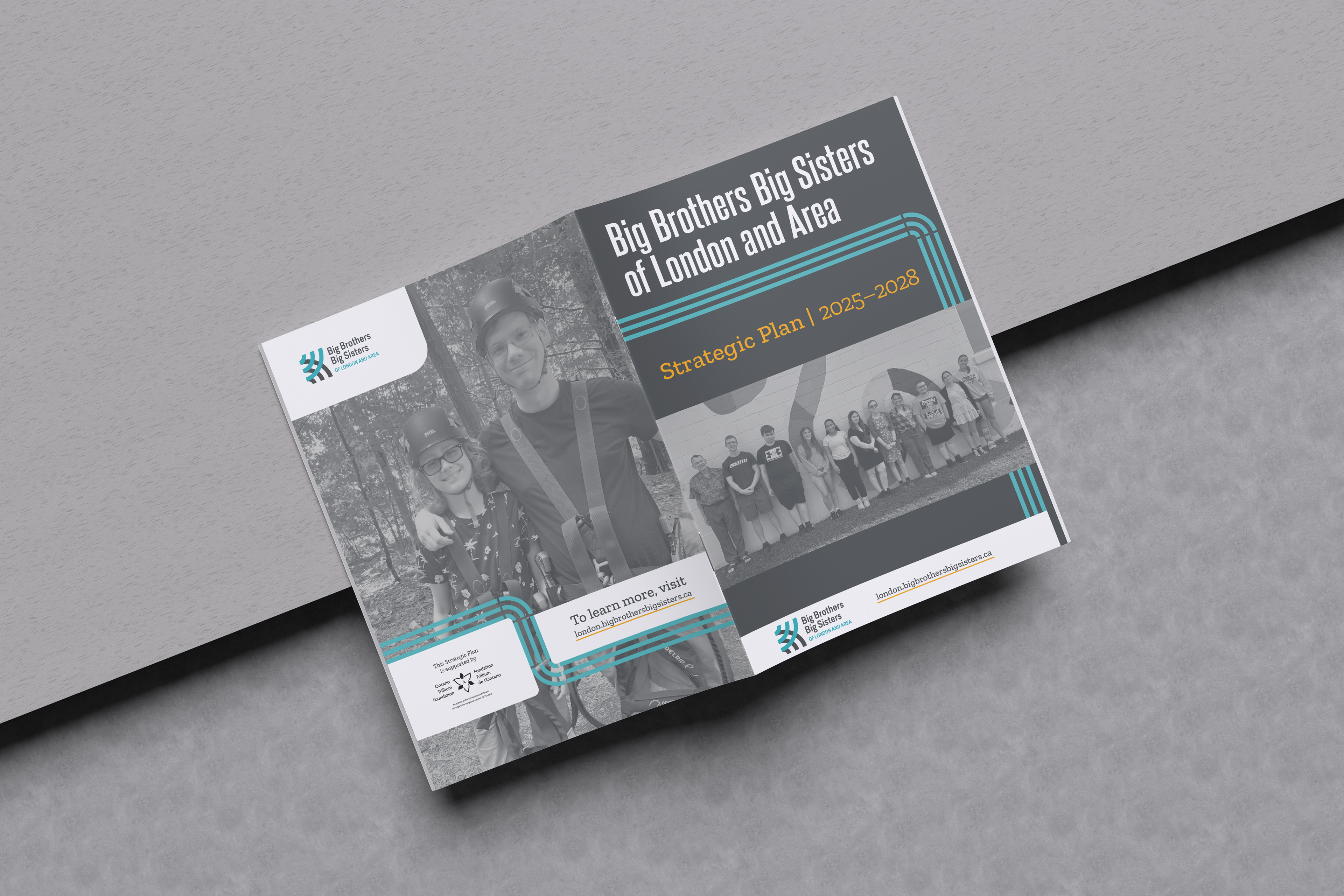
The branding element I pulled from most frequently was the three-line graphics. I incorporated creativity and joyful user experience by varying line length and direction to emphasize different sections. This strategy established flexible continuity and consistency across pages.
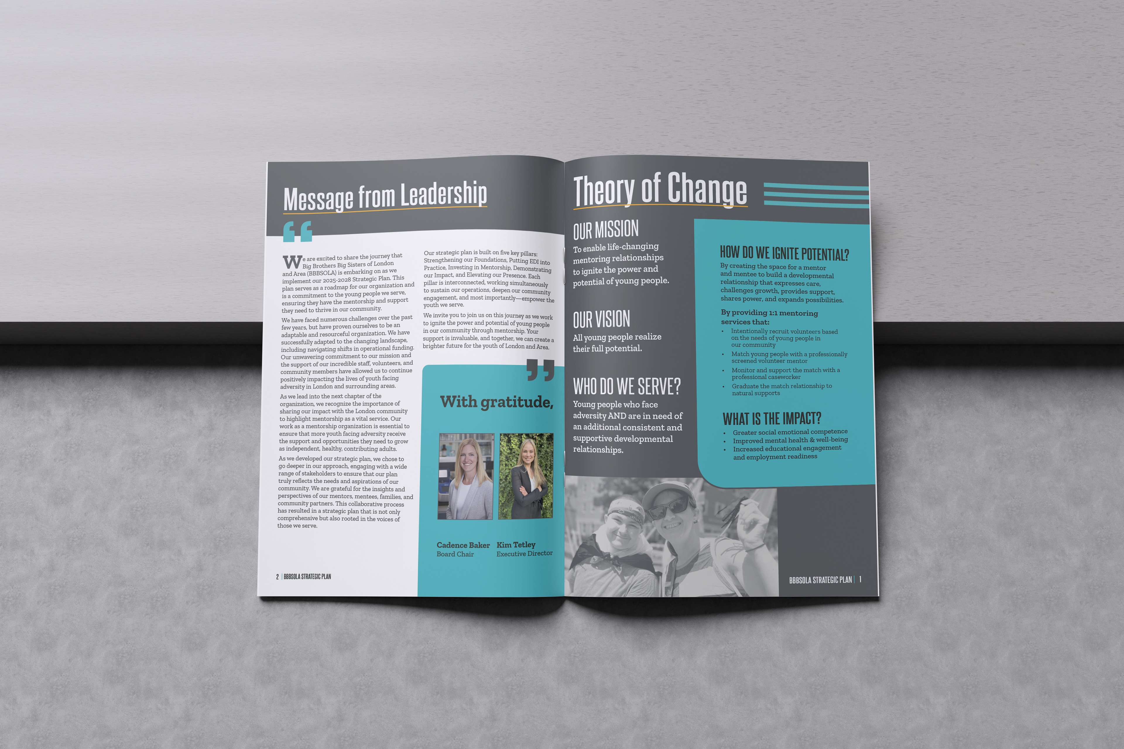
Carefully applied colour adds positivity and highlights key information while maintaining professionalism. Yellow underlines accent titles, while blue boxes spotlight key information.
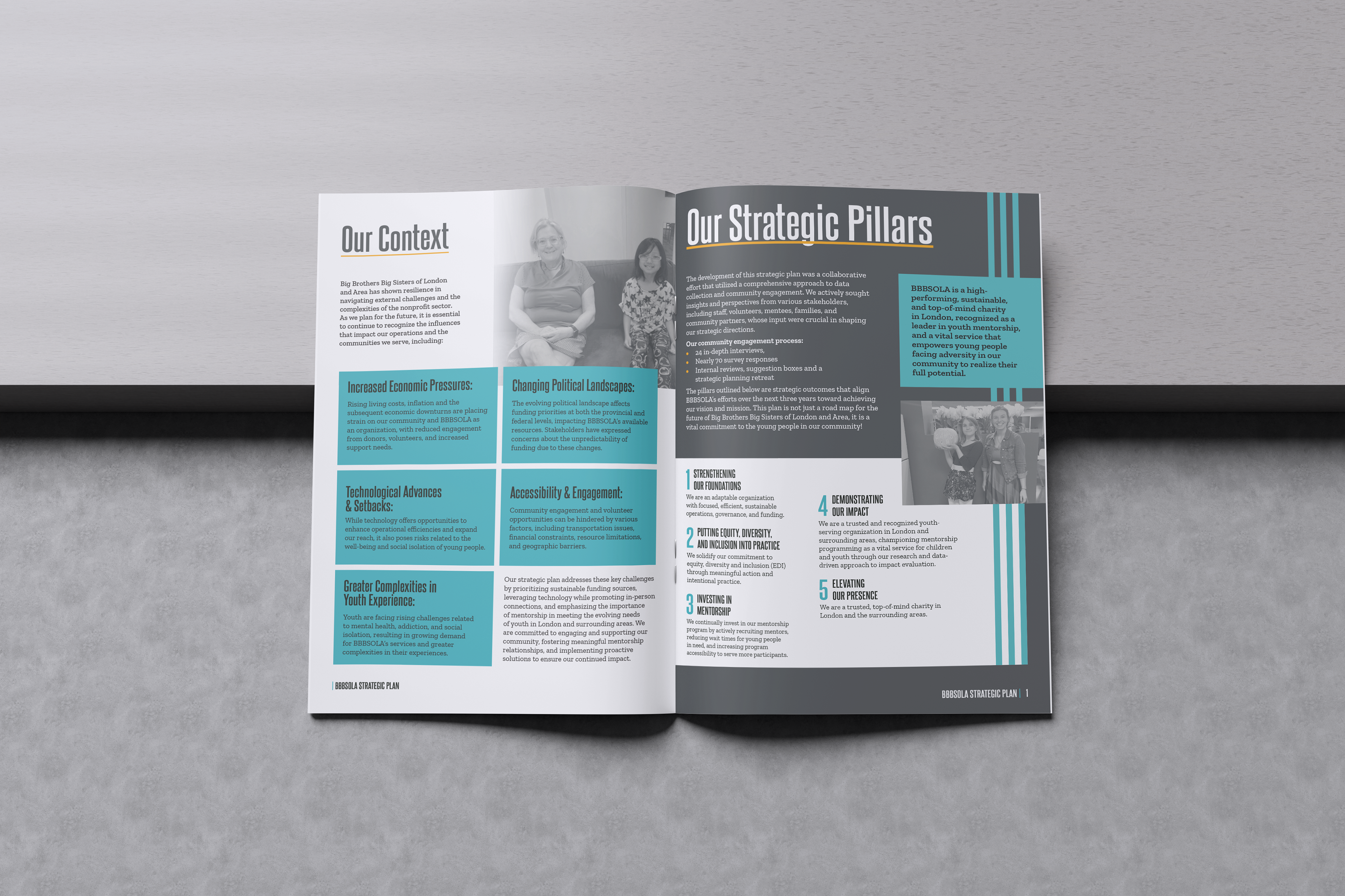
Designing the individual pages for the strategic pillars with the same layout unifies them as a collective section. The three lines graphics are also a nod to the pillar concept. Different fonts of the main typefaces add visual interest, as well as the triangular bullets and large blue letters.
