Magazine Editorial Illustration
Personal Work
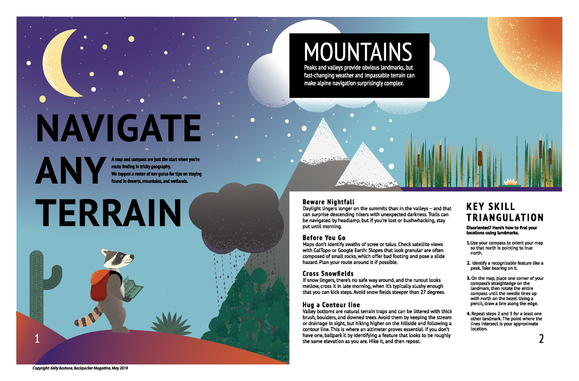
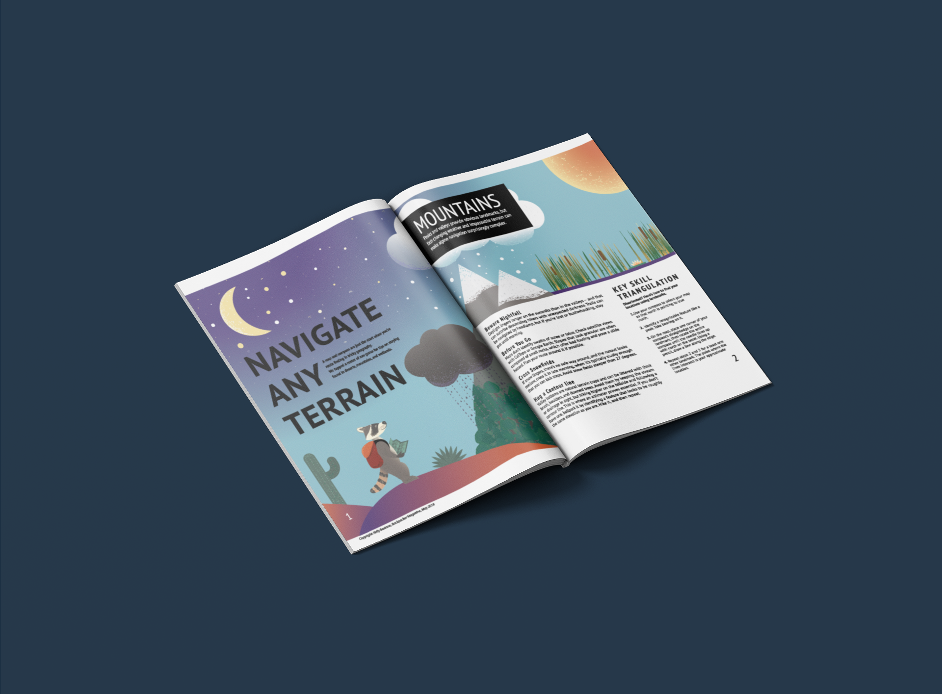
The purpose of this assignment was to design two illustrations that were appropriate for the content of the article as well as cohesive in style. The article is about navigating terrain and being an informed and safe adventurer.
My goal for these illustrations was to encapsulate the article from start to finish. In terms of theme, we had recently learned how to create stippling brushes in Illustrator, and I am a big fan of grainy and gradient looks. So I aimed to include those features.
After brainstorming with a classmate, I liked the idea of having a racoon character feature in the illustrations. The idea of a skyline came to mind as a way to include all of the terrain and weather mentioned in the article, all featured on the first page. Then the second illustration needed to reflect the first, so I planned a first-person perspective of the racoon once they had reached their “end destination,” which was the wetland (both in the article’s order as well as the order of the “skyline”).


I knew this design would need a lot of layers to achieve all of the natural elements as well as their respective textures and stippling, so I planned my layers and dimensions first, before I began designing. This was a helpful strategy.


