Tea Box Design
Personal Work
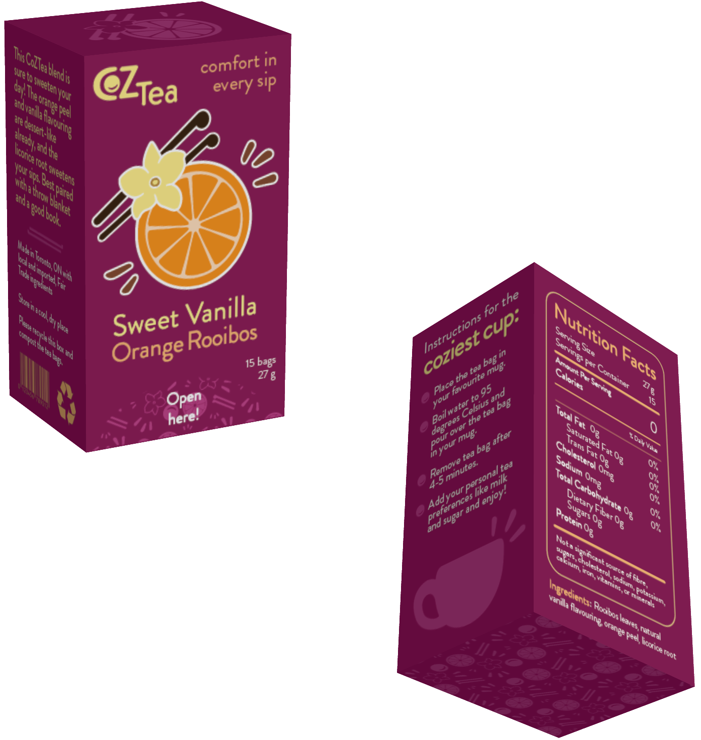
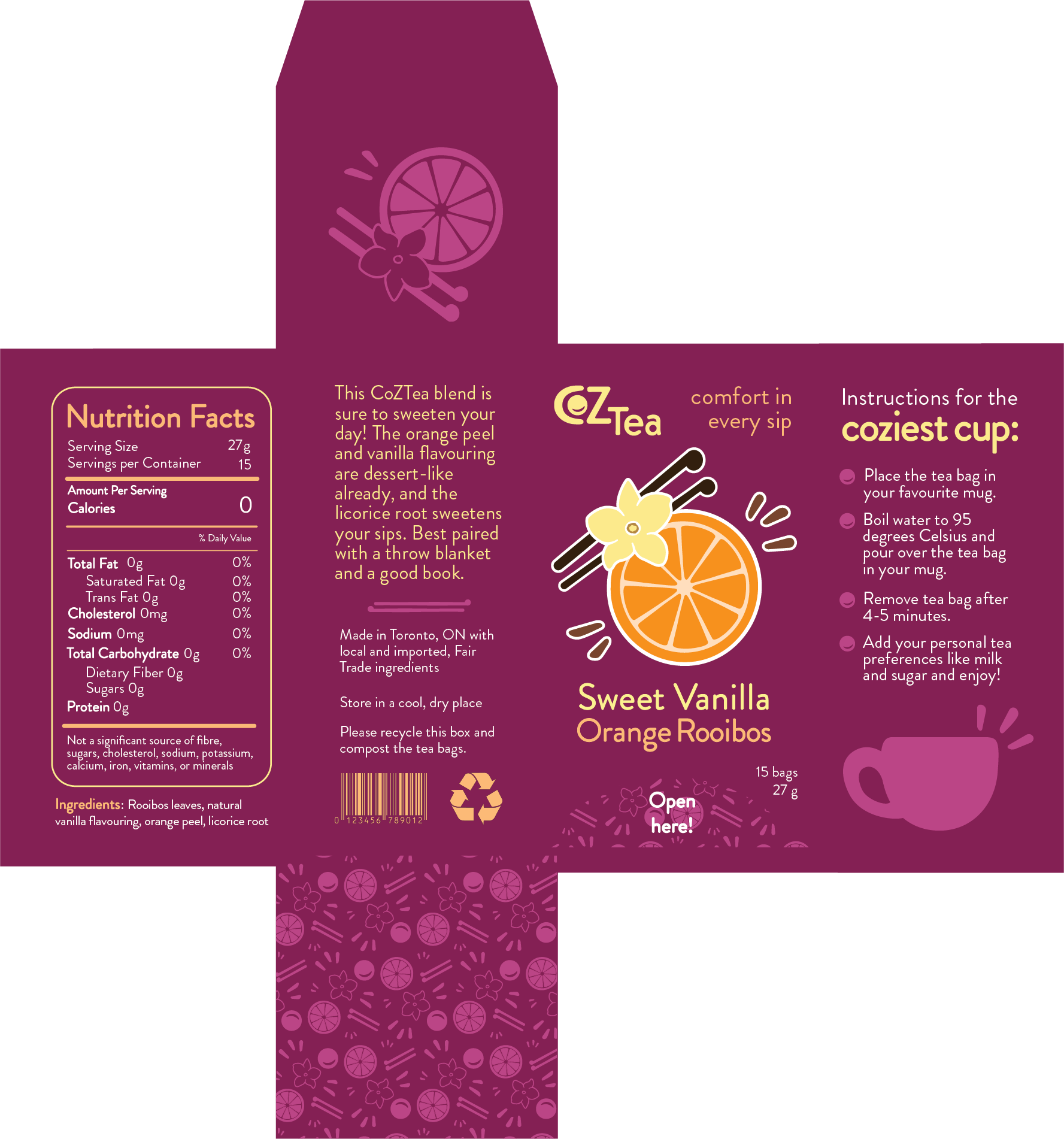
This was another class assignment: to design a tea box, including the branding.
My goal with this design was to embrace hygge – a cozy feeling – which I included directly in the name, CoZeaTea. I also looked up "hygge" graphic design examples on Pinterest and created a mood board.
To capture the cozy theme, I selected the typeface Brandon Grotesque, which is a round serif font that has a cheerful energy. I combined my favourite teas: rooibos (non-caffeinated and creamy), orange (joyful), and vanilla (calm and familiar) and used these flavours to develop a colour palette (orange, cream, and brown). For the background, I selected a warm purple to complement the other colours. I made my illustrations with imperfect lines and added a subtle pattern for visual interest.


